FILM DISCOVERY
FILM DISCOVERY
Role
Lead Designer
Timeline
8 weeks
For
People who loves movies
Tools
Figma
UserTesting
01. Overview
What is Letterboxd and what did I do there?
CONTEXT
What is Letterboxd?
Letterboxd is a social platform for movie enthusiasts to log, review, and share their thoughts on films. It acts as a personalized diary where users can track what they’ve watched, curate lists, and discover new movies through recommendations, friends’ activity, and community reviews.
It’s a space that brings people together to celebrate and discuss the art of cinema.
Download in the App Store or Google Play.
02. Problem Framing
How did we find ourselves in this problem space of needing a socially-driven film discovery process?
Touted as the ultimate social app for movie lovers but failing to spark user connections…
Letterboxd's social features, despite being central to its mission, failed to engage casual viewers effectively. While film enthusiasts thrived on detailed logging and reviewing, everyday users found limited value beyond basic browsing, resulting in low retention.
💡 Challenge: High drop-off among casual users, do not interact with each other at all
🎯 Target: Enhance social film discovery for all user segments
🔑 Focus: Redesigning social interactions to improve engagement
COMPETITIVE ANALYSIS - DIRECT COMPETITORS
Unlike its competitors, Letterboxd is uniquely positioned to build out a differentiated, socially-driven film discovery experience between a user and the people they care about.
Social features can be leveraged to:
Scale user engagement by making interactions more accessible and meaningful
Increase access to personalized film discovery through trusted connections
Later on, we also did another round of competitive analysis with indirect competitors like GoodReads and Beli to identify successful engagement patterns that could enhance Letterboxd's community experience.
VALIDATING ASSUMPTIONS
To validate our focus on social features, we conducted research through:
12 in-depth interviews with users aged 18-24 (Letterboxd's core demographic)
Analysis of the Letterboxd online community
Investigation of user motivations and social interaction patterns
RESULTS OF THE INTERVIEWS - NORTH STAR ARTIFACT
Driven by the Social Spark (most of them!)
Key User Personas & Findings:
Social Butterfly: Values friend recommendations but needs more context (genre preferences, rating patterns) to gauge review relevance
Lone Tracker: Focuses on personal tracking features
Key Insights:
Users primarily seek recommendations from friends with similar movie tastes, making taste compatibility crucial for social engagement
Genre overlap and rating patterns are crucial for establishing trust in recommendations
Even social users need data-driven signals to validate friend recommendations
Design Strategy:
Enhance social features while surfacing taste compatibility metrics
Maintain core tracking functionality
Balance social discovery with data-driven trust signals
NARROWING DOWN
Figuring out which user flows to push for social behavior
Having validated the fact that most of our users would be interested in seeing more of a social aspect, we proceeded to use heuristic analysis to analyze existing flows in the app to see where social features could be enhanced. The two final flows we decided to enhance were:
Adding a friend on Letterboxd
Viewing Friends’ Activity and adding a film into their watchlist as a result
VALIDATING FINDINGS
Key Observations from Moderated Testing
To validate pain points, we conducted moderated usability testing, measuring task completion rates and gathering qualitative feedback. This helped identify key friction points in the user journey that would inform our design solutions.
PROBLEMS WITH OLD DESIGNS
The most number of misclicks and frustration was recorded when users were trying to find friends to add and access that specific friend’s profile later on.
(i) Users cannot find the friend’s activity page easily, making it difficult for them to find friend-driven recommendations
(ii) Users found it difficult to tell which of these movies their friends liked would be a good match for them + insufficient context to click in
These were the main problems we were to readdress in our redesign.
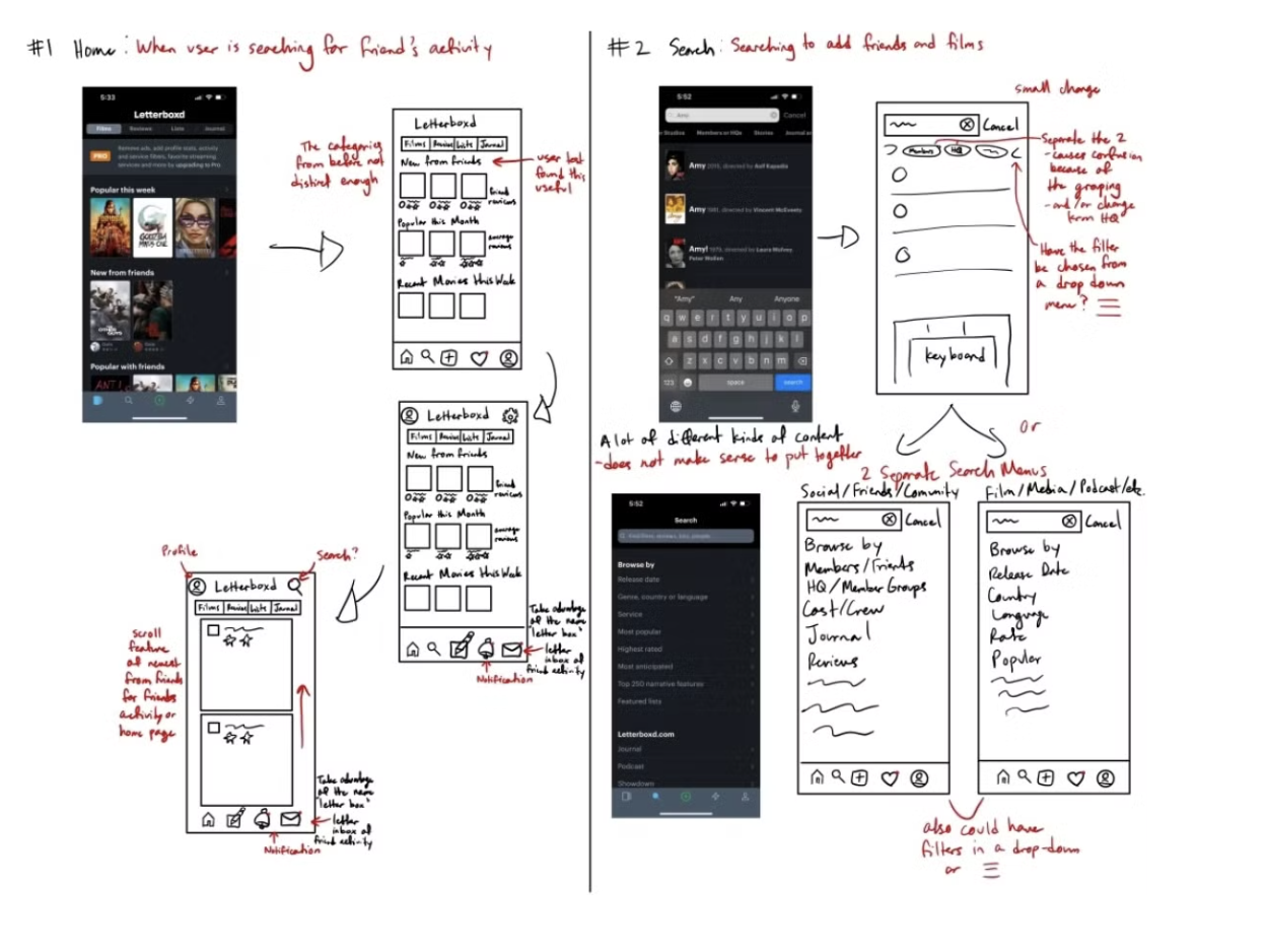
SKETCHES + LOW FIDELITY DESIGNS
Making changes based on user testing
Our Initial Design
Initially, we prioritized trending films and displayed full friend reviews, assuming users valued all friend recommendations equally. We also improved the friend search feature by refining the information architecture for better usability.
Key Learning
Users revealed they primarily trust recommendations from friends with similar tastes. If it was someone who they had no information on their movie taste, then factors like genre and overall ratings became key decision makers.
Final Improvements
Prioritized friend activity feed, added taste compatibility indicators (like matching ratings), and streamlined review display to highlight essential film details.
Adding friends now highlights shared movie interests and genre overlaps, offering personalized suggestions right away. The redesigned feed focuses on friend activity.
We showcased shared favorites and matching genres for easier film discovery through trusted connections.
03. Design Solutions ✨
What are the main UX challenges and design solutions?
+Enriched reviews with details like ratings and genres to boost engagement.
+Trending section now allows users to toggle between Global Trends and Trends Among Friends, catering to both social and tracking-focused users.
DEEP DIVE INTO NEW DESIGN | USER TESTING RSULTS
Home Page immediately highlights more Social Activity to push for discovery
WHAT CHANGED?
Variety of Cards to interact with to increase social engagement
💡 Key Research Findings:
The original Friend Activity feed had poor engagement due to cluttered, low-value updates (e.g., comment likes)
User interviews revealed higher interest in personal movie reviews and curated playlists, especially for niche films
Introducing card variety and random ordering increased scroll depth and watchlist additions by tapping into the brain's reward system through novelty
WHAT CHANGED?
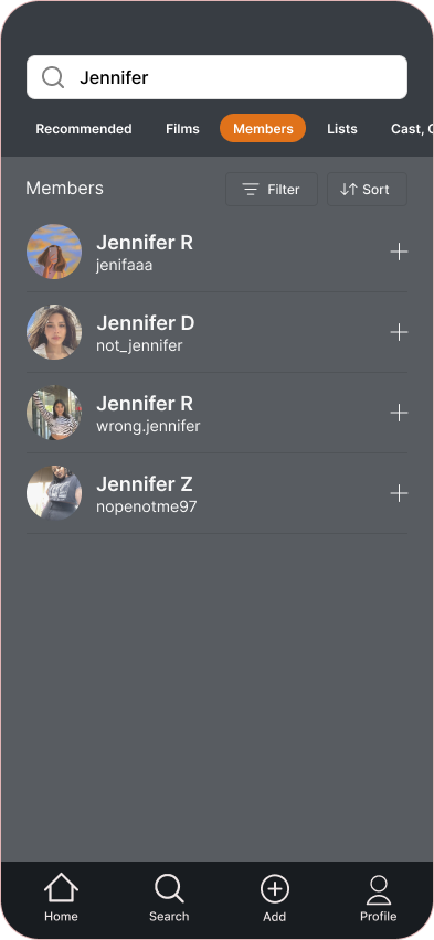
The Search Engine features improved information architecture and copy, making it easier to add friends
Updates based on testing:
Improved information architecture and user-friendly copy for better discoverability.
Replaced "friends" with "members" to avoid confusion and ensure clarity, based on testing insights.
Used card sorting to refine filter order for seamless navigation.
Placement Experimentation:
Initially moved the "Add Friends" option to the profile section during testing.
Returned it to the search engine as a universal feature, aligning with familiar patterns from platforms like Instagram which our users quickly adapted to.
Enhanced Functionality:
Expanded the redesign beyond adding friends, optimizing the search engine for discovering all assets on Letterboxd.
WHAT CHANGED?
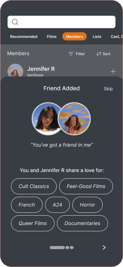
Adding a friend instantly highlights movies to help users compare tastes
User Need: Users wanted recommendations from friends with similar tastes but struggled to identify matches.
Solution: Displayed taste compatibility immediately after adding a friend, rather than on profiles (while we initially did)
Results: Engagement doubled, with users 2x more likely to add movies to their watchlist when compatibility was shown at the friendship formation moment.
Homepage Interactions
Search Engine Interactions
In our design, we emphasized a prominent social feed and highlighted the commonalities between users and their friends. This approach helps users easily recognize which friends' recommendations to take seriously. By prioritizing social content in the information hierarchy, users are immediately greeted with their friends' activities upon entering the app. We also celebrated real-life relationships by showcasing shared favorites and assigning a movie title to describe each friendship. These design choices not only further guided users to identify which friends have similar movie tastes in a really engaging manner, but purposefully brought out specific movie titles for recommendations, making it easy for users to determine which movies they might enjoy or dislike based on their friends' preferences. Altogether, this simplifies and streamlines the movie discovery process by leveraging friends' viewing habits.
04. Final Reflections
What were my biggest takeaways?
What I Learned
I've learned the importance of planning and understanding how each step connects, like conducting heuristic evaluations before user testing to identify key pain points. We focused on tasks where users might struggle, ensuring we prioritized areas that mattered most for the redesign.
I've also gained insight into the right fidelity for prototypes depending on the stage. Early on, we used Crazy-8s to generate ideas, then created lo-fi prototypes for quick feedback from users. For high-level buy-in, a hi-fi prototype would be more appropriate.
As a bonus, our project ended up ranking top in class, which was a nice surprise! 🎁
Future Steps
Due to the time constraints of this project, we were unable to implement our originally planned user testing methodologies. Instead, we opted for a quicker approach, gathering user feedback through informal interviews.
For future iterations of this project, I would propose a more structured testing approach. This would involve designing prototypes that require users to complete specific tasks, allowing us to measure their performance more accurately. Key metrics would include the time taken to complete tasks and the number of errors or misclicks made during the process.
Additionally, I would introduce a rating system where users assess the usefulness of the information provided in our prototypes on a scale from 1 to 7. This would help us understand how well the information supports their decision-making, particularly in scenarios where they need to link a film they discovered through the app.
To gain deeper insights into user priorities, I would also conduct a card sorting exercise. This would help determine the relative importance of different factors presented in the user flows, ensuring that the design aligns with users' preferences and enhances their overall experience.


